


 So my interest in books should come as no surprise, but having spent a very long time being told without explanation that I must type everything formal in Times New Roman font size 11 or 12 (depending on the teacher/professor), I have added to my list of interests: typography. The jump from reading and staring at certain types all day to learning more about the design of types is not a big one, but sometimes it feels like a completely different world. As I am slowly picking up supplies and learning how to use my homemade letterpress, I am becoming increasingly fascinated by the design of letters and how those designs can function in so many vastly different ways depending on the medium in which they are used.
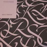
To help me explore this new (and yet very old) world of typography, I ordered issue one of Codex: The Journal of Typography. There is a blog, a link to the publisher’s original blog (ILoveTypography.com) which is one of the best typography resources available in any medium, and a place to order issues of Codex which is a quarterly journal. I’m beginning to suspect that I am becoming a quarterly-junky of sorts. Waiting on Wilder, Lucky Peach, and now Codex too is going to result in me getting way too many journals all at the same time! I suspect I’ll have to start scheduling my days off around when these are arriving!
What I wanted to point out about Codex though, is that it takes the art of writing to a whole new level. Instead of the traditional black and white print versus color electronic media, this blends the traditional black and white color scheme of print and bolder graphics with colors. Just flipping through this journal gives me a sense of electronic media and print media interacting in a great way. Instead of letting the art of type fall to the wayside as certain texts become the standard fare and the internet makes the creation of text a fun past time instead of a skill that people use to make a living, this joins the two and discusses the future of typography with a respectful nod to its history.
Also, I absolutely love the way they designed the cover for issue one. It’s beautiful and classic, while looking sharp and contemporary all the same. I highly recommend taking a look at the blogs if not ordering a copy for yourself here. I hope you enjoy!